INTERIOR DESIGN
The relationship between the interior designer and the AV technologist should be established early during the creative design phase of a project. Media spaces require careful attention to sound and light control best achieved in cooperation with the interior designer and architect in step with other contractors invited to specify the building and/or room technical requirements.
After listening to dozens of end user complaints about underwhelming performance in media spaces, here is a list of topics that need to be discussed early in the project to better meet the customer's expectations.
● Media space interior design selection should NOT include materials that reflect light or sound. Light paint, shiny fabrics and neon lights should be avoided. Reflected light on the screen will wash out the picture. Colors selected should be mid to dark tones for a more vibrant image. Hard wall surfaces, glass, tile, wood floors and stone should be avoided. Carpeted floors and an acoustic treatment on the rear wall will do wonders to eliminate sound reflections.
● Lighting control needs to be designed in advance. In multi-use public venues, the stage lighting may be used most of the time for events, but if the stage lights can not be completely shut off, the projected image will be washed out. The use of neon in smaller venues should be avoided or be easily switched off. Although the wall washing sconce lighting is attractive, these too should be easy to dim or switch off. If there are requirements for lighting during an event, avoid directing any of the light toward the screen.
● Select AV equipment before media cabinets, bookshelves, media closets and equipment racks are specified. It is very difficult early in the design phase to select the exact equipment, however, REPRESENTATIVE equipment must be selected to complete the design. Representative equipment will be measured for cabinet fitting, cabling estimates, power requirements, cooling requirements, mounting hardware specifications and in-wall and in-ceiling back box specifications.
● The goal should NOT be to build a miniature version of the local cinema; many audio and video compromises are made for a large public cinema. Public theater designs ARE NOT good home/education/business AV venue solutions.
● Bigger is better. Large displays are easier to watch, can accommodate more people and are more enjoyable. Big speakers just sound better.
● Cabling pathways, cooling and power need to be designed in advance. Power for ceiling projectors in public venues needs to have a disconnect at the ceiling. Projector power above the ceiling tiles is an NEC code violation.
● Hiding the technology effects the performance. If large floor standing speakers are possible the client will enjoy the best sound. Floor standing speakers are available finished beautifully in oak, cherry, walnut and many other fine materials. If the speakers must be placed on the wall, consider surface mount wall speakers before flush mount wall speakers. Projects with specific requirements for ease-of-use, multi-use and public venues will demand that the speakers and display be hidden or at least not free standing on the floor.
● Multipurpose room requests are usually a trap without an acceptable AV solution. Where possible try to avoid AV designs for multipurpose rooms. Help the clients and architects understand that movable room partitions pass distracting sound across the divider. And roll about displays are too small for most venues.
● Avoid speakers in open spaces made of glass and stone: open design will send audio traveling throughout the entire building.
● User interface and daily operational requirements need to be understood early so lighting, air handling, and AV functions can be integrated into the design.
● Maintenance, repair, equipment care and other ongoing operational services and costs are part of the design.
● Wide venues will not meet any industry AV standards for surround sound OR screen viewing angles. Very wide multipurpose venues "do not a good theater make".
The local commercial theater "shoebox" design promotes the maximum optimum seats for both viewing the screen and listening to surround sound. Rotating the "shoebox" by 90 degrees to create an attractive wide stage multipurpose space is an AV design nightmare: both for projector screen viewing angles and surround sound acoustics.
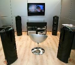
Good speaker placement; Bad hard reflective surfaces
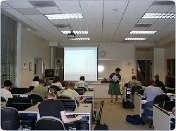
Ceiling lights in the front of this room wash out the image on this screen

Good speaker placement; Good wall color selection

Bad cabinet design; No HDTV for this client

Great speaker placement, screen, seating and lighting
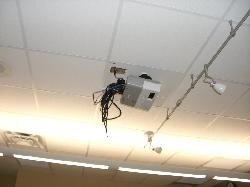
Power disconnect meets NEC Code, however projector cabling is a disaster
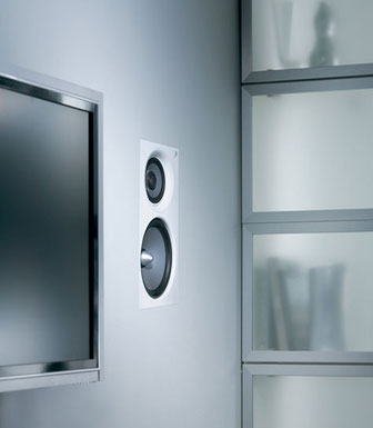
Flush wall speakers can usually be heard on the other side of the wall. In-Wall monitors can have cooling issues, shortening the life of the display.

AV in this multipurpose room is a disaster. Screen is too small and sound from the display will not be clear for the participants.
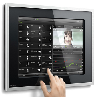
High end user interface integrating lights, music, video playback, security, shades, and AV control.
